Transforming Healthcare with VR: Virtual Surgery and Patient Simulation
 [Sponsored] The healthcare sector is rapidly evolving with technological advancements reshaping the way medical professionals approach patient care. Among the most groundbreaking innovations is Virtual Reality (VR), which is increasingly being utilized to improve medical training and even real-life procedures. Virtual Reality in healthcare encompasses a variety of applications, but two of the most promising areas are virtual surgery and patient simulation. These technologies are transforming how we train healthcare professionals, conduct procedures, and manage patient care.
 I like to play beach volleyball here in the Toronto area. I also watch beach volleyball on YouTube, which includes a lot of live streams from the
 Over the last 10 years or so I’ve done a ton of technical editing work. I’ve helped with CSS articles and CSS books for various online and print publications. One of the things that comes up often when I make suggestions is the difference between a CSS rule and a CSS ruleset.
 [Sponsored] If you’re building an app that requires a lot of user-generated content and media that needs to be processed, tagged, filtered, or otherwise manipulated in real-time, you definitely want a solution that’s fast and seamless and doesn’t get in the way of your app’s primary functionality. Filestack is a service you’ll want to consider. Here’s what Filestack offers:
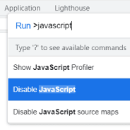 In 2022 I think it’s still important as a web developer to test your how your websites look and function when users disable JavaScript in their browser. Developing in this way used to be a cornerstone of Progressive Enhancement and can be handy on both desktop or mobile.
 This week I did some research to try to build a hamburger menu that opens a slide-out navigation panel, a common design pattern nowadays. But I wanted to ensure the whole thing was keyboard-friendly and as accessible as possible.
 Over on CSS-Tricks, Chris breaks down what some in the industry have said on the possibility that there will one day be a CSS4. The latest article that Chris references is one by a well-respected member of the community, Peter-Paul Koch (“PPK”).
 I probably don’t need to tell you that if you want to make it easier marketing yourself as a strong front-end web developer, it’s important to learn React. No, it’s not absolutely crucial, nor is it required. But React is undoubtedly the most important UI library in the front-end landscape in 2019 and it’s not going away anytime soon.