
 I like to play beach volleyball here in the Toronto area. I also watch beach volleyball on YouTube, which includes a lot of live streams from the AVP league in the US. It’s a fun sport that I recommend to anyone looking for a new athletic competition to follow.
In most leagues and tournaments, beach volleyball games have a 3-set format, with each set finishing when a team reaches 21 points (or higher if they’re not yet ahead by 2). The third set (played if needed) will go up to 15 points (again, win by 2). Some leagues/tournaments will play all three sets up to 15. It depends on the venue, tournament, etc.

 Over the last 10 years or so I’ve done a ton of technical editing work. I’ve helped with CSS articles and CSS books for various online and print publications. One of the things that comes up often when I make suggestions is the difference between a CSS rule and a CSS ruleset.
 [Sponsored] If you’re building an app that requires a lot of user-generated content and media that needs to be processed, tagged, filtered, or otherwise manipulated in real-time, you definitely want a solution that’s fast and seamless and doesn’t get in the way of your app’s primary functionality. Filestack is a service you’ll want to consider. Here’s what Filestack offers:
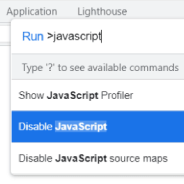 In 2022 I think it’s still important as a web developer to test your how your websites look and function when users disable JavaScript in their browser. Developing in this way used to be a cornerstone of Progressive Enhancement and can be handy on both desktop or mobile.
 [Sponsored] If you’re building an app that requires delivering a dynamic experience based on the user’s location or other location-related data, a fast and easy-to-use Geolocation API will certainly come in handy. One such option is
  Recently I came across a CodePen demo by a developer/engineer named Jane that was Tweeted out by Šime Vidas. The demo has a neat collection of HTML and CSS tricks rolled into one that I thought was worth examining in detail.
 When I come to the end of any given year, it’s always interesting to look back through the click-through stats for my weekly newsletter
  When I visit a page, I get annoyed when I try to interact with elements while the website is still loading. Often stuff is moving around, fonts aren’t quite loaded, and it feels broken.